 AppKickstarter
Customization
Learn how to customize your app to make it yours!
Application Metadata
Most of the application metadata is configured in apps/expo/app.config.ts. From here, you can change:
- The app name
- The app version
- The app owner
- The bundler identifier
version
Do note that each time you update the app version, it will have to be reviewed by Apple before it can be distributed to your users on TestFlight.
However, we have apps/expo/eas.json configured such that if you don't manually bump up the version value here, and you build the app with EAS (recommended), it will auto-increment the build number:
"production": {
    "environment": "production",
    "channel": "production",
    "autoIncrement": true
}
This will distribute the app to your users on TestFlight without needing a review, useful for getting changes out quickly.
Whenever you make changes to app.config.ts, you will need to rebuild your application.
App Icon
The app icon is defined in apps/expo/app.config.ts:
ios: {
    icon: "assets/icon.png",
    ...
},
android: {
    adaptiveIcon: {
        foregroundImage: "./assets/adaptive-icon.png",
        backgroundColor: "#ffffff",
    },
},
You can replace the image with your own by replacing the files.
You will need to run npx expo prebuild --clean and before creating a new build (e.g. npx expo run:ios) due to automatic asset caching.
Be sure to follow the app icon guidelines: https://docs.expo.dev/develop/user-interface/splash-screen-and-app-icon/#app-icon
Splash Screen
The splash screen image is defined in the plugins section of apps/expo/app.config.ts:
[
    "expo-splash-screen",
    {
        backgroundColor: "#000000",
        image: "./assets/splash-screen.png",
        resizeMode: "contain",
        imageWidth: 256,
    },
],
You can replace the image with your own by replacing the splash-screen.png, as well as change the background color of the splash screen.
Be sure to follow the app splash screen guidelines: https://docs.expo.dev/develop/user-interface/splash-screen-and-app-icon/#splash-screen
Themes
By default, AppKickstarter will follow the device's system appearance (light, dark, or automatic). This is the recommended approach for most apps, as it provides a seamless experience for users who have set their device to a preferred mode. This is defined in apps/expo/app.json's userInterfaceStyle value.
Configuration
The way styling works is in 2 files: apps/expo/tailwind.config.js, and apps/expo/global.css.
CSS Configuration apps/expo/global.css
This file contains the "base" definitions of colours for your app. These are the foundational colors for your app. They are defined in RGB. There are definitions for light mode and dark mode colors, for iOS and Android.
Tailwind Config apps/expo/tailwind.config.js
This file contains the "override" definition for your app. You can override colors, fonts, text sizes, etc. here.
- For the full documentation of how this file works, please see the TailwindCSS documentation
The key things to know are:
content: you want to make sure this contains all the possible paths where you would want the Tailwind compiler to compile styles. By default, we wildcard all TypeScript and JavaScript files in the app and ui package.
Additional documentation for theming in Nativewind can be found here: https://www.nativewind.dev/docs/guides/themes#dynamic-themes
There are 2 main ways to change the colors of your app: editing the base CSS (globals.css), or creating overrides in tailwind.config.js.
Light & Dark Mode
By default, the app will automatically use the colors defined in global.css for the current utility & theme. This is handled by CSS media queries, just like the web. For example, let's look at the foreground color:
tailwind.config.js:
theme: {
    extend: {
        colors: {
foreground: withOpacity("foreground"),global.css:
:root {
    --foreground: 0 0 0;
    ...
}

...

@media (prefers-color-scheme: dark) {
:root {
    --foreground: 255 255 255;
When we define a className with this color (e.g. <Text className={"text-foreground"}>), it will automatically pick the light mode foreground color or the dark mode foreground color depending on the system. In this case, the foreground color for light mode will be white, and for dark mode, black. This is the same as how Tailwind works for the web.
To change the color of a utility (border, ring, foreground, background, etc.), simply edit the global.css file with the preferred color.
You can also make use of the dark: selector in the classNames for further flexibility. For example, if you want a button to be different custom colors between light & dark modes:
<CheckmarkIcon className="bg-green-800 dark:bg-green-500" />In the above example, in light mode, the icon will have a darker shade of green than dark mode.
Additional documentation here:
- https://www.nativewind.dev/docs/guides/themes
- https://tailwindcss.com/docs/colors#using-css-variables
When changing anything theme-related, you will likely have to restart the development server (yarn dev) for the changes to be re-bundled and updated.
Fonts
Fonts are loaded in apps/expo/app/_layout.tsx.
Make sure to only hide the splash screen (SplashScreen.hide(); in apps/expo/app/_layout.tsx) AFTER fonts have been loaded for the best experience. This is currently how AppKickstarter is setup.
Quick Actions
The uninstall intercept is powered by expo-quick-actions. This allows you to place certain actions/screens/links/etc. when the user holds on the app icon in the home screen.
By default, we open a link to a screen in the app if the user selects on one:
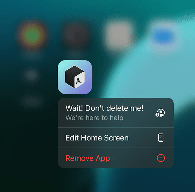
You can customize this to perform anything else! AppKickstarter is setup with a callback to handle these quick actions:
import {
  useQuickActionCallback,
} from "expo-quick-actions/hooks";

useQuickActionCallback(action => {
// … do something, like Linking.openURL(action.params.url) or router.push(...)
});
The Expo documentation contains more information: https://expo.dev/blog/expo-quick-actions